Advanced Event Viewer presents you with option to view the event logs visually. This is by the means of various Graphs. Currently, there are 3 types of Charts available in Advanced Event Viewer:
- Bar Chart
- Heat Map
- Scattered Graph
Bar Chart

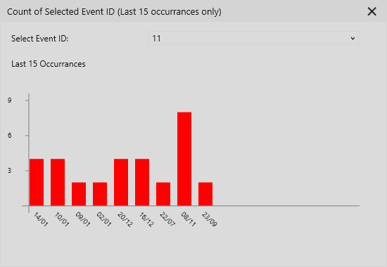
Bar Chart shows the count of events logged per day for last 15 days. This helps in understanding the fluctuation of the event count per day and can help in understanding the impact of the event on a particular day. This can be useful when you only want to focus on a particular time range when the event was logged the most.
Heat Map

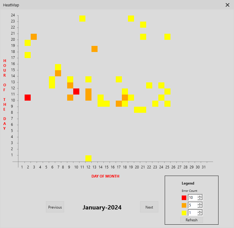
Heat Map (as the name suggests) is the HeatMap of the sum of errors (Error + Critical events) logged per hour. If the total count of errors exceed the predefined range, the hour block is colored accordingly. The predefined range can be changed as per the requirement. You will need to refresh the heatmap after adjusting the predefined range to re-draw the Heat Map. Hovering over the hour block will show the number of errors logged at that particular hour.
Scattered Graph (V1)

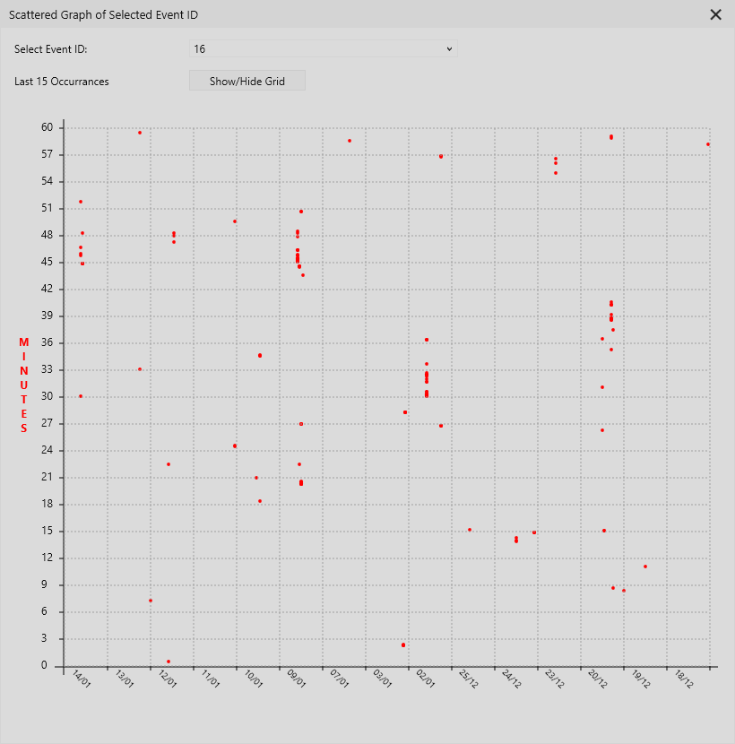
Version 1 of Scattered Graph is very simple graph of the selected event. The scattered points indicate the date and time at which the event was logged. Hovering over the particular point shows the date and time of the event. You can hide or show the grid which are aligned with the date and time fields on the X and Y axis. The X axis represents the Date. The position of the point on the X axis for the particular date is determined by the hour at which it was logged. Y axis represents the Minutes at which the event was logged.
Scattered Graph (V2)

Version 2 of the Scattered Graph provides the ability to select multiple events. It however inverts the X and Y axis. It shows the Date on X Axis. The position of the point on the X axis is determined by the minute at which the event was logged. The Y Axis represents the Hour at which the event was logged. Version 3 shows last 30 occurrences of the selected events if available. Each time you select a new event, all the previous scattered points are cleared and the scattered graph for each selected event is drawn again. You can only selected maximum of 5 events.
Scattered Graph (V3)

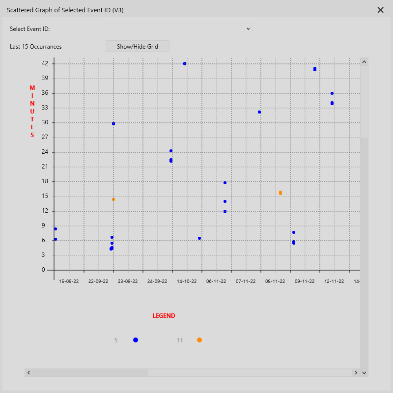
Version 3 of the Scattered Graph is similar to Version 2 with the exception of inverted X and Y Axis. The X axis represents the Date. The position of the point is determined by the hour at which the event was logged on that particular date. The Y Axis represents the Minutes at which the event was logged. This additionally has a legend which shows the ID and Color of the selected event.
Version 2 and Version 3 of the Scattered graph also allows changing the color of the scattered point for the event ID.
